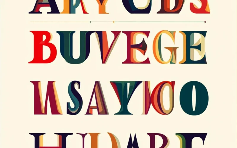
In today’s fast-paced and visually saturated world, choosing the right typeface is more crucial than ever. Among the many options, Helonia Neue has emerged as a favorite choice for designers looking to blend style with functionality. This modern sans-serif font has captured attention for its clarity, versatility, and contemporary aesthetic, making it a go-to option for branding, digital interfaces, editorial layouts, and signage. In this article, we will explore the origins of Helonia Neue, its key features, applications, and how it is shaping the future of design.
The Origins and Evolution of Helonia Neue
Helonia Neue didn’t appear overnight. Its design stems from the growing need for fonts that marry modernity with readability across various platforms. The typeface emerged as a response to the limitations of traditional sans-serif fonts that, while aesthetically pleasing, often lacked the versatility needed for digital interfaces and smaller text sizes. Helonia Neue was crafted to solve this problem by integrating geometric precision with humanist warmth, making it suitable for both large-scale print designs and digital screen usage.
Helonia Neue’s evolution built on the success of its predecessor, Helonia. The original typeface, which was also a sans-serif design, served as a foundation, but it lacked the refined details that Helonia Neue offers. Over time, designers focused on enhancing legibility, creating better kerning, and expanding the character set. This careful refinement resulted in a more adaptable and versatile typeface that has quickly gained popularity in the design community.
Key Features of Helonia Neue
Helonia Neue stands out in the world of typography due to its thoughtful design and distinct features that contribute to both its visual appeal and functional usability. Let’s break down some of the key aspects that make Helonia Neue a top choice for designers.
Clean, Modern Lines
The structure of Helonia Neue is built upon clean, geometric shapes that lend the typeface its sleek and modern look. The sharpness of its lines gives it a timeless quality—appealing not only to contemporary tastes but ensuring its longevity as a design asset. The geometric precision of the letters gives the typeface a consistent rhythm that’s easily recognizable and pleasant to the eye, whether used in headlines, body text, or logos.
Balanced x-Height
One of the standout features of Helonia Neue is its balanced x-height. The x-height refers to the height of lowercase letters like ‘x’, ‘a’, and ‘e’ in comparison to the overall height of uppercase letters. In Helonia Neue, the x-height is moderately high, which enhances its readability. This feature is particularly valuable for text-heavy projects, such as reports, articles, and web pages where legibility at small sizes is critical. It also ensures that the typeface remains highly readable on digital screens, where text often needs to be scaled down without losing clarity.
Wide Range of Weights
Another key strength of Helonia Neue is its wide range of weights. Whether you need something ultra-light and airy or bold and commanding, Helonia Neue offers a weight for every design need. Designers can play with different weights to create typographic hierarchies, making it versatile for a wide array of projects—from elegant branding materials to bold editorial headlines.
The availability of multiple weights adds an additional layer of flexibility for designers, allowing them to use the same font family in diverse contexts without losing visual harmony.
Extended Character Set
A robust and extended character set is one of the defining features of Helonia Neue. It includes a variety of special characters, symbols, numerals, and multilingual characters, ensuring it can be used across different languages and regions. This extended set makes it perfect for global brands and international projects, where a diverse audience needs to be catered to. The comprehensive character set also ensures that Helonia Neue can be used for a wide variety of applications, from business reports to advertising campaigns in multiple languages.
Geometric Precision with Humanist Warmth
While Helonia Neue is primarily a geometric font, its subtle humanist influences are what make it approachable. The font’s clean lines and geometric shapes provide a crisp, professional appearance, while the softer edges and slight curvature in certain characters offer warmth and approachability. This unique combination makes Helonia Neue an excellent choice for designs that require both professionalism and human touch.
Applications of Helonia Neue
The versatility of Helonia Neue extends far beyond its aesthetic qualities. The typeface’s adaptability makes it a popular choice across multiple design disciplines. Let’s take a closer look at where this font truly shines.
Branding and Identity
In branding and identity design, Helonia Neue offers a modern yet timeless appearance. Its clean and minimalistic design makes it ideal for creating strong, memorable brand identities. Many global companies have adopted Helonia Neue for their logos and brand materials, using it to project professionalism while maintaining a contemporary feel. Its wide range of weights allows designers to experiment with different typographic hierarchies, ensuring that each brand message is communicated clearly and effectively.
Digital Interfaces and Web Design
For digital design, especially on websites and mobile applications, Helonia Neue is a standout option. The balanced x-height and legibility at small sizes make it perfect for reading on screens. Whether it’s used for website copy, buttons, or navigation menus, Helonia Neue ensures a seamless user experience across various devices. Additionally, its extended character set supports multilingual interfaces, making it ideal for global web projects.
Editorial and Print Design
When it comes to print design, Helonia Neue excels in both editorial layouts and marketing materials. The versatile weights allow designers to create strong headlines while maintaining legibility in body text. Whether it’s used in magazines, brochures, or annual reports, Helonia Neue brings a contemporary feel to any print project while ensuring that the text is clear and easy to read.
Signage and Wayfinding
The clarity of Helonia Neue extends to environmental design, especially signage and wayfinding systems. Its geometric structure ensures high legibility from a distance, while the softened edges make it less rigid, creating a welcoming atmosphere in public spaces. Whether it’s used in airports, shopping malls, or corporate offices, Helonia Neue guarantees that important information is easy to read and navigate.
Comparing Helonia Neue with Other Fonts
When compared to other modern sans-serif fonts, Helonia Neue stands out for its combination of geometric precision and humanist warmth. Fonts like Helvetica or Futura are often considered the go-to choices for sans-serif typefaces, but they can sometimes feel cold or impersonal. Helonia Neue, on the other hand, adds a subtle warmth to its geometric design, making it more versatile for a wider range of applications.
While Helvetica offers a similar modern look, it lacks the same level of refinement and readability at smaller sizes that Helonia Neue provides. Similarly, Futura, with its more rigid geometric design, doesn’t offer the same flexibility in terms of weight variations, making Helonia Neue a more adaptable choice.
How Helonia Neue Is Shaping Modern Design
Helonia Neue is helping to shape the future of typography by offering a perfect blend of style, functionality, and readability. It is leading the way in modern type design, where designers need fonts that can adapt across a variety of platforms while maintaining clarity and visual appeal. As more designers embrace this typeface, it will continue to influence trends in both print and digital design, pushing the boundaries of how type can be used effectively in branding, advertising, and communication.
Designer Perspectives and Industry Reception
The design community has widely embraced Helonia Neue for its balance of modern aesthetics and practical usability. Many professional designers appreciate the font for its versatility, ease of use, and adaptability across different design contexts. It has been featured in numerous design portfolios, with many creatives choosing it for high-profile client projects.
One common sentiment among designers is the versatility of the font. Whether used for a minimalist website or a bold logo, Helonia Neue stands the test of time, offering flexibility without compromising on style or readability.
Future Trends in Typeface Design: What’s Next for Helonia Neue?
As we look toward the future, Helonia Neue is poised to evolve with the ever-changing demands of the design world. While it already stands as a strong contender for modern typography, its creators are likely to continue refining it, possibly by adding new weights, styles, or even variable font options. This would further enhance its ability to adapt to new platforms, devices, and design trends.
We may also see Helonia Neue being adopted more widely in emerging industries like VR/AR interfaces, where high legibility at various scales and resolutions is critical. The font’s geometric yet humanist design makes it an ideal candidate for the next generation of digital design.
Conclusion
Helonia Neue is more than just a typeface; it’s a tool that blends the best of modern design with functionality. Whether you’re designing for print, digital, or signage, its clean lines, balanced x-height, and wide range of weights make it an adaptable and versatile choice. As it continues to shape the design landscape, Helonia Neue will remain a go-to font for designers looking for both style and readability in their projects.

